Northeast marketing coordinator designs Norfolk’s 150th anniversary logo
June 3, 2015
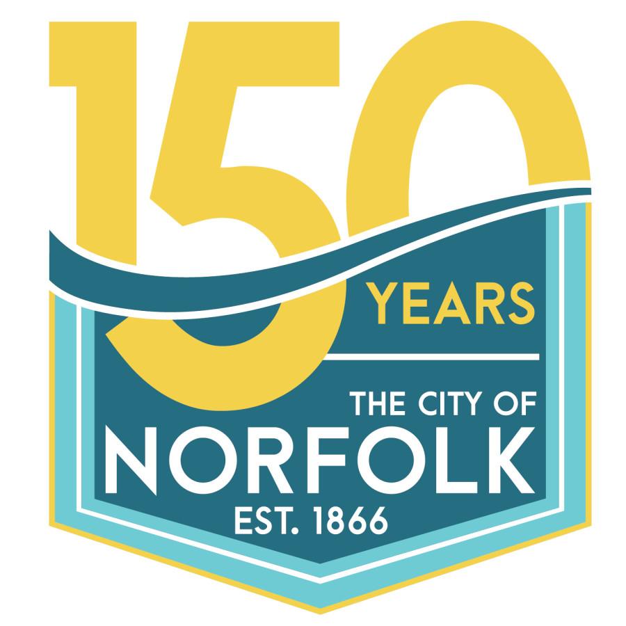
NORFOLK – A logo that will be used to mark the City of Norfolk’s sesquicentennial has been designed by an artist who works at Northeast Community College.
The design of Jeanette Johnson, Northeast publications coordinator, will be incorporated into everything surrounding the community’s 150th anniversary in 2016.
“The colors I selected for this piece were chosen to depict the vibrancy of Norfolk and the design was developed to reflect the importance of the Elkhorn River as the lifeblood of Norfolk since its inception,” Johnson said. “The blue recalls the water of the Elkhorn River, also represented by the swath running through the ‘150’. The yellow calls on the grains grown in the region and also the sun that shines upon the Elkhorn Valley.”
In addition, the zero in the logo’s 150 intersects with an underlining blue; much like the sun rises and sets along the Elkhorn River.
Johnson said, “I believe that this design has a pleasing yet striking composition, setting it visually apart from other artwork used to promote the city. As an added benefit, it varies greatly from other anniversary logos that have been used by towns in the region in recent years – relying more on color, symbolism, and feeling than a direct representation of city landmarks.
Johnson works in the Northeast marketing office which serves as the clearinghouse for all marketing and promotional materials for Northeast Community College. She, along with Jennifer Greve, director marketing, work to enhance the public image of the College and creatively promote awareness of Northeast’s programs and services to prospective students and members of the public.
“Jeanette has an amazing talent and we are fortunate to have her on our team,” Greve said.


